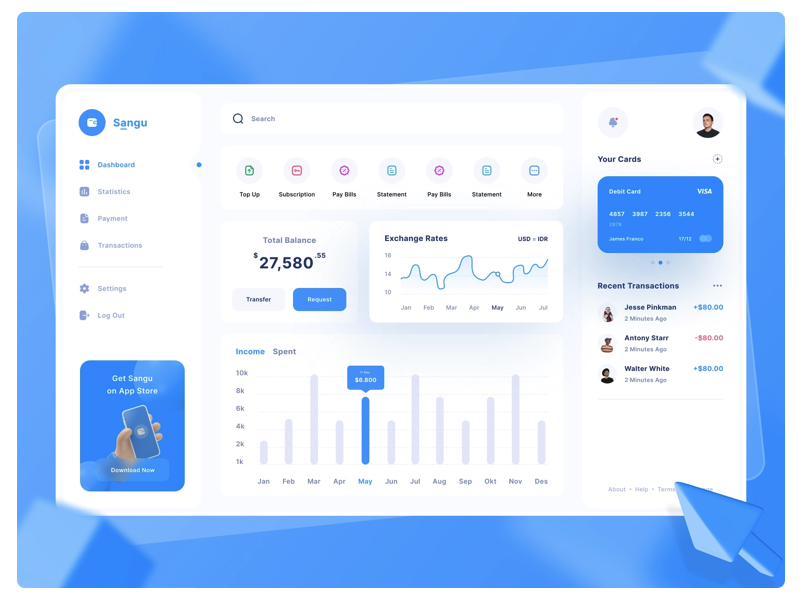
My Design Principles 💙
- Simplicity is key: A cluttered interface can be overwhelming and confusing for users. I love keeping the design simple and clean, and only include elements that are necessary.
- Using consistent design patterns: Using consistent design patterns helps users feel more at home with your application. It also makes it easier for them to navigate and understand the various features of your application.
- Make use of white space: White space, or negative space, can help draw the user's attention to specific elements of the interface and make it feel more organized and spacious.
- Use appropriate typography: The right font can help set the tone for your application and make it more legible for users. Therefore, I suggest choosing a font that is easy to read and appropriate for the purpose of your application.
- Using appropriate color schemes: The color scheme you choose can affect the mood and emotion of your application. I will help you choose colors that are appropriate for the purpose of your application and that work well together.
- Using responsive design: With the proliferation of different devices and screen sizes, it's important to ensure that your application looks good and functions well on all devices. I allways use responsive design techniques to ensure that your application looks and works great on desktop computers, tablets, and smartphones.
- Test and iterate: No design is perfect on the first try. I suggest testing your application with users and gather feedback (I can also do this for you, if you want :) The feedback will be used to iterate on the design and improve the overall user experience.